You are using an out of date browser. It may not display this or other websites correctly.
You should upgrade or use an alternative browser.
You should upgrade or use an alternative browser.
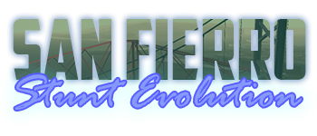
New SF-SE Logo
- Thread starter ellie
- Start date
Chaos
Former Staff
Looks good, matches with the general theme of the forums but isn't is kind of the same as the previous one?
bear
Server Owner
It's all very well to criticize, but if you're going to do so, at least offer feedback as to why or make your own logo that you feel to be an improvement.
Lmfao.
I wanted to make the same joke in early June, but decided not to. The thing is almost instantly after Luis published this version of the logo, the current version was added to the forum. As a result, it looked like Luis' logo was pretty much a copy of the existing logo. Even though the forum's logo before Luis' suggestion was completely different (was there a logo at all?).Looks good, matches with the general theme of the forums but isn't is kind of the same as the previous one?
No idea why Windu bumped this after 2 months, though.
I did make the current logo xD the logo before was a default logoI wanted to make the same joke in early June, but decided not to. The thing is almost instantly after Luis published this version of the logo, the current version was added to the forum. As a result, it looked like Luis' logo was pretty much a copy of the existing logo. Even though the forum's logo before Luis' suggestion was completely different (was there a logo at all?).
No idea why Windu bumped this after 2 months, though.
Mazee
New Member
Would like to elaborate this word.
Well, It is indeed bad, color blending is bad, choice of colours are bad, overly-used outer glow/drop shadow, wrong taste of fonts, specially in the text "Stunt Evolution" the "stroke" effect in it looks overkill(not really needed since the default forum theme is light unless needed to).
I hope you understand and keep in touch with my feedback and I hope you will make good improvements soon. Best of luck for you.
Lmfao. There is a shit ton of variations of this logo, the one we currently use is one of them. I've been using Photoshop for years now. But thanks for the feedback.Would like to elaborate this word.
Well, It is indeed bad, color blending is bad, choice of colours are bad, overly-used outer glow/drop shadow, wrong taste of fonts, specially in the text "Stunt Evolution" the "stroke" effect in it looks overkill(not really needed since the default forum theme is light unless needed to).
I hope you understand and keep in touch with my feedback and I hope you will make good improvements soon. Best of luck for you.

